CSS Masks – How To Use Masking In CSS Now
Almost one year ago I wrote an article that dealt with an emerging WebKit CSS technique, the CSS filter effects, and the question if we could not have/emulate them in other browsers, too. Turned out we could.
Today I want to talk about another WebKit-only feature and show you how you might be able to use it across all of the browsers: This is about…
CSS Masks #
CSS masks were added to the WebKit engine by Apple quite a while ago, namely back in April 2008. Masks offer the ability to control the opacity/transparency of elements on a per-pixel basis, similar to how the alpha/transparency-channel of "24-bit"-PNGs or 32-bit-TIFFs work.
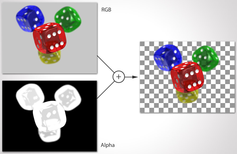
These images consist of the usual R(ed) G(reen) and B(lue) channels that define the colors of each pixel. But on top there is a fourth channel, the alpha channel, that defines every pixel's opacity through luminance: White meaning opaque, black meaning transparent, and countless grey values defining the semi-transparent inbetweens. As you can see in the picture to the left.
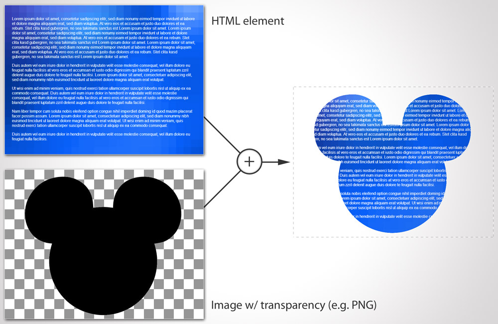
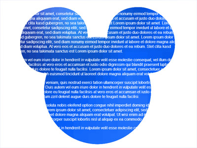
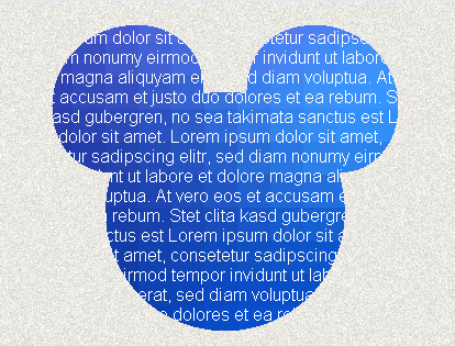
With CSS masks it is an HTML element that gets this type of treatment. And instead of using an alpha channel you assign an image resource to a CSS property named -webkit-mask-image, e.g. -webkit-mask-image: url(mouse.png);. Transparency is then read from that mask image and applied to the HTML element, like the picture on the right shows.
Neat! So what could that be good for? Well, masking could be used for images to style them in shapes. Or you could have long scrollable text smoothly fade out by using a mask image with a gradient from opaque to transparent.
As with the background-image property you can also use a CSS gradient instead of an actual bitmap image, as in this code example:
Note: Beware that this is the "old" syntax that will soon be replaced by linear-gradient(to bottom, rgba(0,0,0,1), rgba(0,0,0,0)) (the destination keyword changes to to bottom). Lennart Schoors has a short article on that topic.
-webkit-mask-image: -webkit-linear-gradient(
  top,
  rgba(0, 0, 0, 1),
  rgba(0, 0, 0, 0)
);
While Apple brought CSS masks to WebKit, they failed to specify their implementation details and file a proposal with the W3C. Which means that if other vendors would have wanted to implement masks they would have had to reverse engineer and find out about all the implementation details first. Dirty work nobody wanted to do. So it was not until a few days ago, on the 15th of November (2012), that there appeared a first public working draft by the W3C called CSS Masking. But that one will be rather different to Apple's version.
The good news: Turns out the other browsers do have different capabilities which we can use as hooks to emulate WebKit's proprietary CSS masks. Woot!
Emulating a simple -webkit-mask-image cross browser #
So let's say we want to mask an HTML element to the shape of a mouse's head as seen in the picture above.
With WebKit's proprietary CSS masks we would have this HTML:
<div class="element">
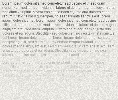
<p>Lorem ipsum dolor sit … amet.</p>
</div>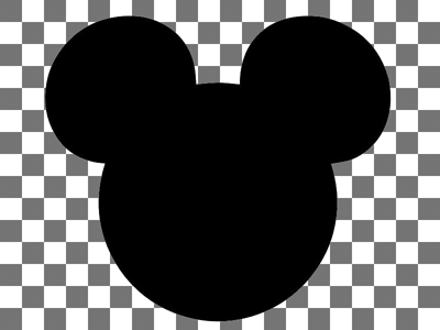
And define the following CSS:
.element {
  width: 400px;
  height: 300px;
  overflow: hidden;
  color: #fff;
  background: url(background.png);
  -webkit-mask-image: url(mouse.png);
}
The modern browsers #
Let's start with the modern browsers.
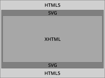
Current HTML5-ready browsers are able to parse SVG embedded inline into HTML, like so:
<!DOCTYPE html>
<html>
<body>
  <svg width="300px" height="300px">
    <circle cx="125"
            cy="150"
            r="50"
            fill="pink"
            stroke="green"
            stroke-width="5" />
  </svg>
</body>
</html>
On top of that WebKit as well as Firefox and Opera are also capable of doing the opposite - embedding XHTML into SVG, thanks to SVG 1.1's extensibility feature and its <foreignObject>-element:
<?xml version="1.0" standalone="yes"?>
<svg width="400px" height="300px" version="1.1" xmlns="http://www.w3.org/2000/svg">
  <foreignObject width="400px" height="300px">

    <!-- HTML begin -->
    <div class="element">
      <p>Lorem ipsum dolor sit … amet.</p>
    </div>
    <!-- HTML end -->

  </foreignObject>
</svg>
Internet Explorer 9 and 10 are, the only modern browsers that lack support for <foreignObject>. We will turn to the IEs later.
What inline-SVG and <foreignObject> enable us to do is to enclose certain parts of our page's HTML in SVG wrappers, in this case the HTML blocks we want to mask:
<!DOCTYPE html>
<html>
<head>
  <style>
    .element {
      width: 400px;
      height: 300px;
      overflow: hidden;
      color: #fff;
      background: url(background.png);
      -webkit-mask-image: url(mouse.png);
    }
  </style>
</head>
<body>

  <!-- SVG wrapper begins -->
  <svg>
    <foreignObject width="400px" height="300px">

      <!-- inner HTML begins -->
      <div class="element">
        <p>Lorem ipsum dolor sit … amet.</p>
      </div>
      <!-- inner HTML ends -->

    </foreignObject>
  </svg>
  <!-- SVG wrapper ends -->

</body>
</html>
Next step is to define an SVG-mask inside our inlined SVG that we can feed a mask image, and then apply that via style="mask:[mask id]" to our foreignObject/embedded HTML:
<!DOCTYPE html>
<html>
<body>

  <!-- SVG begins -->
  <svg>

    <!-- Definition of a mask begins -->
    <defs>
      <mask id="mask" maskUnits="userSpaceOnUse" maskContentUnits="userSpaceOnUse">
        <image width="400px" height="300px" xlink:href="mouse.png"></image>
      </mask>
    </defs>
    <!-- Definition of a mask ends -->

    <foreignObject width="400px" height="300px" style="mask: url(#mask);">

      <!-- HTML begins -->
      <div class="element">
        <p>Lorem ipsum dolor sit … amet.</p>
      </div>
      <!-- HTML ends -->

    </foreignObject>
  </svg>
  <!-- SVG ends -->

</body>
</html>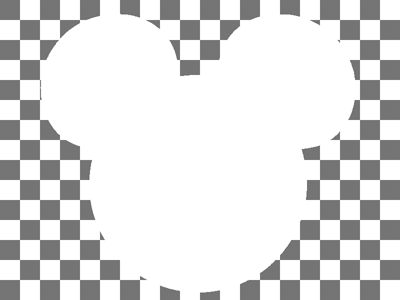
And finally we need to have a proper mask image. We cannot simply use the image from WebKit's proprietary CSS mask, since SVG masks do not look at transparency values but at luminance values. So what we need to do is turn all opaque image pixels into shades of white.
In Photoshop that's super easy:
- Open the transparent 24-bit-PNG you want to use as mask
- Select the "Layer" menu, then "Layer Style" and finally "Color Overlay"
- In the "Color Overlay" dialog change the color to white
- Close the dialog with "OK"
- Select the "File" menu, "Save for web", and replace the old file.
And KABOOOM! Masking of HTML content is up and running in WebKit, Firefox and Opera! Nice.
The Internet Explorers #
Internet Explorers <= 8 do not understand any of the SVG markup above. They will just treat those tags as unknown elements. They will render the page as if it had this HTML code:
<!DOCTYPE html>
<html>
<body>
  <svg></svg>
  <defs></defs>
  <mask id="mask" maskUnits="userSpaceOnUse" maskContentUnits="userSpaceOnUse"></mask>
  <image width="400px" height="300px" xlink:href="mouse.png"/></image>
  </mask><//mask>
  </defs><//defs>
  <foreignObject width="400px" height="300px" style="mask: url(#mask);"></foreignObject>

  <div class="element">
    <p>Lorem ipsum dolor sit … amet.</p>
  </div>

  </foreignObject><//foreignObject>
  </svg><//svg>
</body>
</html>
This is cool, since this automatically degrades gracefully.
Where we have a problem is with IE9 and IE10. Both of them know SVG but they do not know the <foreignObject>-element. They render the SVG but consider the part that is enclosed into <foreignObject> was invalid SVG markup. So they discard this part of the SVG altogether. Meaning: our content is lost to our readers. Not good.
We could think about hiding the SVG parts for IEs using conditional comments but Microsoft decided for IE10 that they remove CCs altogether. So no solution yet.
The only solution we have is a) to test the client for the support of SVG extensibility / <foreignObject> and b) have JavaScript render the SVG snippets when SVG extensibility is supported. This is the JavaScript we need, and that we put at the head of our page:
function head () {
  if (window.SVGForeignObjectElement) {
    document.write('\
      <svg width="400px" height="300px">\
        <defs>\
          <mask id="mask" maskUnits="userSpaceOnUse" maskContentUnits="userSpaceOnUse">\
            <image width="400px" height="300px" xlink:href="mouse.png"/>\
          </mask>\
        </defs>\
        <foreignObject width="100%" height="100%" style="mask: url(#mask);">\
    ');
  }
}

function foot () {
  if (window.SVGForeignObjectElement) {
    document.write('\
        </foreignObject>\
      </svg>\
    ');
  }
}
And in our HTML markup we need to replace the SVG parts with calls to those JavaScript functions:
<body>
  <script>head();</script>
  <div class="element">
    <p>Lorem ipsum dolor sit … amet.</p>
  </div>
  <script>foot();</script>
</body>
Now content will remain intact in all Internet Explorers that do not support <foreignObject>. Should IE11 support it, it will get to see it.
Note 1: The backslashes you see at the end of lines inside our strings allow for multiline strings. They are supported by every browser and were officially standardized with ECMAScript 5.
Note 2: Isn't document.write the Antichrist of JavaScript best practices? He's nuts! Why is he using it? Well, nothing is just black and white - it all depends on the context. document.write is indeed very very bad if you make use of it in external JavaScript files. document.write forces you to embed external scripts at predefined places of your HTML and prevents almost any attempts of making them load asynchronous. And that means that if these external scripts fail to load, they'll bring your page to a grinding halt. But we are not dealing with an external file here - and you should leave it that way. So there is no blocking. Plus, thanks to having JavaScript outputting the extra markup to the screen while the HTML parser is still running you don't get to witness any flash of unstyled content (FOUC) as it would be the case if you fired a script on DOMContentLoaded. Now back to topic…
We could stop here and all be happy. But how about getting CSS masks working in the IEs, too? Wouldn't that take the cake? Well then, let's go…
Internet Explorers 4 - 9 have a proprietary filter named "Chroma". What the Chroma filter does is comparable to the filmmaker's bluebox / greenscreen technique: it lets pixels of an element in a defined color vanish from the screen. The color is therefore used as a "color mask".
The following CSS code would let disappear all cyan colored parts of an element:
filter: progid:DXImageTransform.Microsoft.Chroma(color='cyan');
zoom: 1; /* Needed in IE < 8 */
Why cyan? Well it is just a suggestion. You are not bound to cyan, you are free to use any color you like as color mask. But this is probably the one color that nobody would ever use to colorize anything, right? So it cannot get mixed up with content that should not be masked.
Now, what's even more interesting with the chroma filter is the fact that the filter does not only look at the colors of the filtered element itself but also takes into account it's children. Because of this one could create some sort of 10px thick frame by applying the following styles:
.parent {
  width: 120px;
  background-color: #eee;

  filter: progid:DXImageTransform.Microsoft.Chroma(color='cyan');
  zoom: 1;
}
.child {
  height: 100px;
  margin: 10px;

  background-color: cyan;
}
to this markup:
<div class="parent">
  <div class="child"></div>
</div>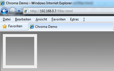
Then the cyan area of the element .child would be punched out of the filtered element .parent and we could look through it.
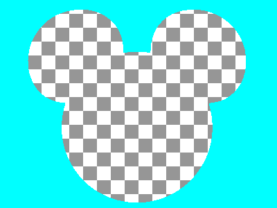
So coming back to our mouse shaped example, what we need to do is create a version of the mouse shape image, where the outer parts are cyan and the inner shape is transparent as seen above.
In Photoshop do the following:
- Open the existing SVG mask PNG
- Hold CMD/Ctrl-key pressed and click on "Layer 0" in the layers window
- Press the Backspace key (or the "Del" key on Windows) on your keyboard to remove the white
- Select "Invert selection" from the "Select" menu
- Click into the "Foreground Color" and change it to #00FFFF (RGB: 0,255,255)
- Select "Fill" from the "Edit" menu, take the foreground color as fill
- Select the "File" menu, "Save for web"
- In the "Save for web" dialog chose "PNG-8" with 2 colors and transparency
- Save as separate file, e.g. "mouse-cyan.png"
Saving with just 2 colors removes the anti-aliasing from the shape's borders. The reason we need to do that is because the chroma filter can only punch out one single color.
Now we need to layer that image over the element we want to mask, like in the picture on the right.
A difficulty we face with that is that we need to accomplish this without using CSS's position property. Why? IE's filters disable themselves when they hit positioned elements. The best approach is to work with negative margins in order to slide the cyan mask over the element, e.g.:
<div class="element">
  <p>Lorem ipsum dolor sit … amet.</p>
</div>
<img src="mouse-ie.png" style="display: block; margin-top: -300px;">
And now you would filter the whole thing:
<div style="width: 400px; height: 300px; filter: progid:DXImageTransform.Microsoft.Chroma(color='#00FFFF'); zoom: 1;">
  <div class="element">
    <p>Lorem ipsum dolor sit … amet.</p>
  </div>
  <img src="mouse-ie.png" style="display: block; margin-top: -300px;">
</div>
A sad aspect of this technique is that Microsoft decided besides conditional comments to remove all proprietary filters from IE10. They also removed them from all of the legacy modes. So this solution remains one for IE 4 to 9 only.
In order to serve this to the IEs we need to extend our JavaScript a bit:
function head () {
if(window.SVGForeignObjectElement) {
document.write('\
<svg width="400px" height="300px">\
<defs>\
<mask id="mask" maskUnits="userSpaceOnUse" maskContentUnits="userSpaceOnUse">\
<image width="400px" height="300px" xlink:href="mouse.png"/>\
</mask>\
</defs>\
<foreignObject width="100%" height="100%" style="mask: url(#mask);">\
');
} else {
document.write('\
<div style="width: 400px; height: 300px; filter: progid:DXImageTransform.Microsoft.Chroma(color=\'#00FFFF\'); zoom: 1;">\
');
}
}
function foot () {
if(window.SVGForeignObjectElement) {
document.write('\
</foreignObject>\
</svg>\
');
} else {
document.write('\
<!--[if lte IE 9]>\
<img src="mouse-ie.png" style="display: block; margin-top: -300px;">\
<![endif]-->\
</div>\
');
}
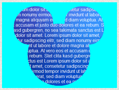
}So if <foreignObject> is supported we wrap our element into SVG, if not we wrap it into markup that triggers IE's filters (IE <= 9). In the end this gives us a CSS mask in all browsers except one: IE10. Still pretty awesome, isn't it? Here is the final result:
Note that this works best when you use masks that use hard clipping along their shape edges. Should you be interested in masks with softer edges then you will lose IE support, as the chroma filter is not capable of punching out shapes with soft edges. Which is okay, too.
In any case, don't forget to check if the outcome without mask applied degrades nicely. Because there is IE10. And because JavaScript might be disabled, too.
Have I really said "all browsers browsers except one"? Ooops, I lied. This is true for desktop. Most mobile WebKit browsers still trail behind technology-wise. Not only Android but also Safari on iOS can't handle our SVG magic well. So for them we will double our SVG mask with -webkit-mask-image. We can assign that in our stylesheet:
.element {
  width: 400px;
  height: 300px;
  overflow: hidden;
  background: #36f url(background.png);
  color: #fff;
  -webkit-mask-image: url(mouse.png);
}
Finally, we are done!
Linear Gradient Masks #
Remember the beginning where I told you that you could also use a gradient as mask? This is also possible in all of the above browsers, with some changes to our setup. First we need to replace the SVG's <mask>'s content either with an image of a gradient or we take the pure SVG route and define a SVG rectangle that is filled with an SVG gradient, like so:
<mask id="mask" maskUnits="userSpaceOnUse" maskContentUnits="userSpaceOnUse">
  <linearGradient id="g" gradientUnits="objectBoundingBox" x2="0" y2="1">
    <stop stop-color="white" stop-opacity="1" offset="0"/>
    <stop stop-color="white" stop-opacity="0" offset="1"/>
  </linearGradient>
  <rect width="400px" height="300px" fill="url(#g)"/>
</mask>
This represents a gradient that goes from top to bottom (from X1,Y1:0,0 to X2,Y2:0,1), who's first color stop is a fully opaque white and who's second stop is a fully transparent white.
For IE we don't need a cyan colored image any more since we will not use the chroma filter this time. Instead we will use the "Alpha" filter. We used to use the alpha filter to polyfill the missing opacity property in older IEs. But it is capable of much much more. You can switch it into a gradient mode where you can define start and end points as well as start and end opacities. It's a simple as this:
filter: progid:DXImageTransform.Microsoft.Alpha(Opacity=100,FinishOpacity=0,Style=1,StartX=0,FinishX=0,StartY=0,FinishY=300);This gradient style alpha filter starts at pixels 0,0 and extends to pixels 0,300. Start opacity is 100%, end opacity is 0%.
On mobile WebKit we should normally be fine with a
-webkit-mask-image: -webkit-linear-gradient(top, rgba(0,0,0,1), rgba(0,0,0,0));but it turns out that Android 2.x does not support gradients as mask image. We have no choice but to point to a PNG of a gradient, that starts opaque at the top and fades out into transparency to the bottom. Since -webkit-mask behaves like background it repeats images that are smaller than the area to cover. Therefore it is sufficient to use an image with a 1px width and 300px height. Finally to save on HTTP requests we embed the image as data URI with the help of duri.me. So this is the assigment we make in out stylesheet:
-webkit-mask-image: url(data:image/png;base64,iVBORw…[shortedned a bit]…FTkSuQmCC);And the following are the changes to our JavaScript:
function head () {
  if (window.SVGForeignObjectElement) {
    document.write('\
      <svg width="400px" height="300px">\
        <defs>\
          <mask id="mask" maskUnits="userSpaceOnUse" maskContentUnits="userSpaceOnUse">\
            <linearGradient id="g" gradientUnits="objectBoundingBox" x2="0" y2="1">\
              <stop stop-color="white" stop-opacity="1" offset="0"/>\
              <stop stop-color="white" stop-opacity="0" offset="1"/>\
            </linearGradient>\
            <rect width="400px" height="300px" fill="url(#g)"/>\
          </mask>\
        </defs>\
        <foreignObject width="100%" height="100%" style="mask: url(#mask);">\
    ');
  } else {
    document.write('\
      <div style="width: 400px; height: 300px; filter: progid:DXImageTransform.Microsoft.Alpha(Opacity=100,FinishOpacity=0,Style=1,StartX=0,FinishX=0,StartY=0,FinishY=300); zoom:1;">\
    ');
  }
}

function foot () {
  if (window.SVGForeignObjectElement){
    document.write('\
					</foreignObject>\
				</svg>\
			');
  } else {
    document.write('\
				</div>\
			');
  }
}
Radial Gradient Masks #
Radial gradients are possible as well. Let's say we wanted to mask an image of 400px × 400px:
<body>
  <script>head();</script>
  <img src="photo.jpg" width="400" height="400" alt="Dude">
  <script>foot();</script>
</body>
Then we would need to change our SVG mask to this:
<mask id="mask" maskUnits="userSpaceOnUse" maskContentUnits="userSpaceOnUse">
  <linearGradient id="g" gradientUnits="objectBoundingBox" x2="0" y2="1">
    <stop stop-color="white" stop-opacity="1" offset="0"/>
    <stop stop-color="white" stop-opacity="0" offset="1"/>
  </linearGradient>
  <rect width="400px" height="400px" fill="url(#g)"/>
</mask>
And switch the alpha filter to style=2, the "2" standing for radial shape:
filter: progid:DXImageTransform.Microsoft.Alpha(Opacity=100,FinishOpacity=0,Style=2);Translated to our script, this is how it would look like:
function head () {
  if (window.SVGForeignObjectElement) {
    document.write('\
      <svg width="400px" height="400px">\
        <defs>\
          <mask id="mask" maskUnits="userSpaceOnUse" maskContentUnits="userSpaceOnUse">\
            <radialGradient id="g" gradientUnits="objectBoundingBox" cx="0.5" cy="0.5" r="0.5" fx="0.5" fy="0.5">\
              <stop stop-color="white" stop-opacity="1" offset="0"/>\
              <stop stop-color="white" stop-opacity="0" offset="1"/>\
            </radialGradient>\
            <rect width="400px" height="400px" fill="url(#g)"/>\
          </mask>\
        </defs>\
        <foreignObject width="100%" height="100%" style="mask: url(#mask);">\
    ');
  } else {
    document.write('\
      <div style="width: 400px; height: 400px; filter: progid:DXImageTransform.Microsoft.Alpha(Opacity=100,FinishOpacity=0,Style=2); zoom: 1;">\
    ');
  }
}

function foot () {
  if (window.SVGForeignObjectElement) {
    document.write('\
					</foreignObject>\
				</svg>\
			');
  } else {
    document.write('\
				</div>\
			');
  }
}
For mobile WebKits we again create a bitmap of a radial gradient. To save a little on bytesize it is sufficient to use an image with the dimensions 50px x 50px. To have that mask stretch over our 400px × 400px object we need to also set -webkit-mask-size: cover.
img {
  -webkit-mask-size: cover;
  -webkit-mask-image: url(data:image/png;base64,iVBORw0…[shortened a bit]…lFTkSuQmCC);
}
Final Words #
I admit it wasn't the shortest of all articles but I hope I got you interested in playing around with masks on the web. So if you happen to create some decent stuff with the aforementioned techniques please drop us a note on Twitter. Also if you have any further questions regarding masks, don't hesitate to give me a shout.
This blog post was originally published at thenittygritty.co/css-masking
Webmentions
No mentions yet.